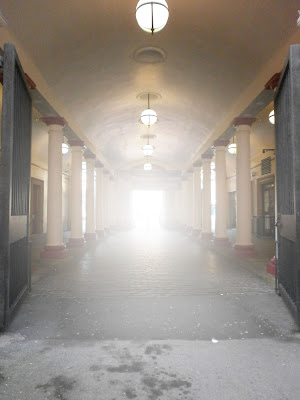
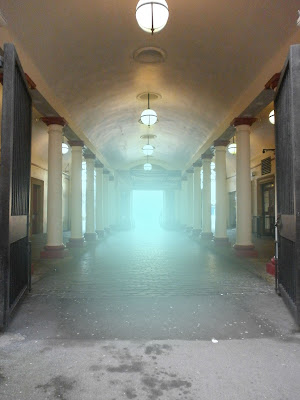
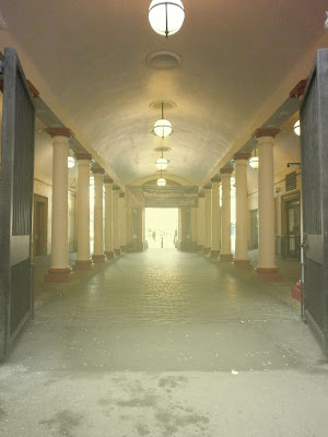
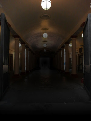
I took one of the photographs and messed around a little in Photoshop with masked layers.
I wanted to see if I could get the image to look faded towards the back to give it a better sense of depth but using white made it look like loads of glare from the light at the end.

I remember reading from one of the task sheets that making it a pale blue in the background gives an image more depth so I tried that next but it still didn't look right.

Definitely the wrong shade of blue and maybe I should have messed with the opacity a little but doing this did give me the idea of trying to make the image look like its sunny outside.

I think this kind of worked. I used two masked layers on this one with a really pale yellow. The first masked layer is a spherical one coming from the end of the walkway to try and make it look sunny there and the second is a horizontal one coming up from the bottom so the road looked a little brighter. I did play with the opacity on this one and I think it looks half decent but not the best.
The last thing I tried doing was to make it look like night time.

I don't think this one worked at all, the end of it looks like the colours have been inverted and it's to dark at the bottom of the image. The inside of the walkway looks alright but the rest looks odd.
No comments:
Post a Comment