Wednesday, 18 April 2012

Prop

For this task we have been asked to design a prop and build using ZBrush. The trip to the Leeds Royal Armoury was to gather reference material to help give us some ideas and to influence our design.

As you can see from a previous post I took lots of photographs from this trip and the ones I really like are these ones:


I know I definitely want to do something with at least one of these but I'm still not sure what, I want to do something Chinese or Japanese because I really like designing that kind of stuff.

I've been to the Royal Armoury before and took loads of photographs then as well, I think I'll look through those photos and see if there is anything there that will give me a more solid idea.

I found a couple of photographs of a Japanese tea set which I took from my previous trip.

I think I like the idea of designing my own tea set for my prop but not too sure yet, may I'll just try sketching some rough ideas in Photoshop and see if anything sparks.

Sunday, 15 April 2012

Organic and Machine 5

went out yesterday afternoon with my camera to try and find some motorbikes I could photograph but I couldn't find any parked on the street. I did end up finding a showroom that sold them but they guy working there wouldn't let me take any pictures, so yesterday was a complete waste of time.

This morning I just looked on the internet to see what was on there.


This is the kind of thing that I found and I like these bikes a lot more than any of the futuristic ones I found yesterday. I definitely like the idea of a sports bike, they are a lot smoother than a dirt bike or a Harley.

I was looking on the internet again for a model of a sports bike that I want to use and came across this image:


It is almost at the correct angle that I want and it is smooth and sleek which is what I want. I'll change the shape of parts of it but I can use this as a base to get the shape right.


I made it a little wider to try and get him sat on it properly and I have changed the shape of the top front part so his knee stays behind it. I'm going to start outlining the bike next and getting the shape I want properly.


This is the basic outline of the bike but some stuff definitely needs changing. The front top part needs to be taller and I think I'm going to get rid of the original image as well and give it a block colour so I can start changing it without having to worry about what it originally was.


I think it looks a little better now that the fronts a little taller but I do have to sort out the angle of the wind shield because it looks a little odd. Also I need to sort out the back wheel, I don't know what this two things sticking out of the wheel are and they look weird so I might get rid of them. I also need put the same pattern on the back wheel as I have on the front.

Saturday, 14 April 2012

Organic and Machine 4

I had my guy open in Photoshop in class and while I was talking to some friends one of them said he would look pretty cool if he was sat on a bike. He is kind of in that pose and If I angle the bike right then maybe it could work. First thing I want to do is look at some futuristic bikes to go with him being part machine.


I don't actually like any of these bikes. Most of the futuristic bikes on the internet looked like these ones and I really don't like the way any of them are designed. Maybe I'll look at some normal motorbikes and see if I want to use any of those. I think this time I will take my camera out and photograph some bikes I find outside.

Friday, 13 April 2012

Organic and Machine 3

I did some artist research, I started by looking at H R Giger but he seemed like an obvious choice and is an artist everyone knows. Instead I looked at Christopher Conte, Daniel Proulx and Pierre Matter.

Daniel Proulx really caught my attention, he makes steam punk jewellery.


I thought they were really cool and the image on the bottom right of the mood board would make a really cool eye replacement for my character design but instead of the metal parts going round to create the ring they would just plug into his head.


I think my next step is probably going to be making some clothes for him and deciding what I'm going to with the thing he's sitting on.

Wednesday, 11 April 2012

Layer Effects Tutorial

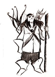
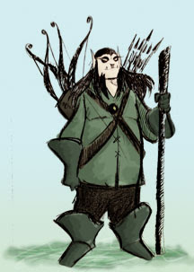
We were given an image of an elf to complete this tutorial:


The task was to follow the tutorial and basically colour this guy in to create a coloured character concept and to experiment with and use layer effects.

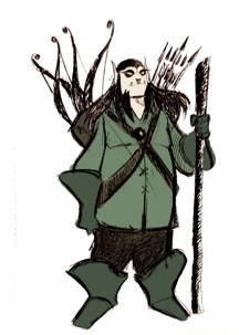
The first thing I have done is to set the original image to a multiply layer effect so I can see the colours underneath this layer and then block in the colours.


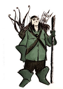
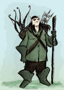
I have added 3 more layers to my image for the dark, mid and light tones. I started with the dark tones and used a multiply layer effect because I liked the way it darkened it but I did change the opacity to 28%. For the mid tones I also used a color burn effect and set the opacity to 12%. For the highlights I used a lighter colour effect with the opacity at 64%.


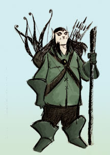
The next part of the tutorial is to sort out a background. I gave it a gradient with a very pale blue and a very pale green.


The grass he's standing on is the next thing.

For the grass I have used 3 more layers to get the effect that I want. The base layer for it is just a normal with a blurry green colour and i few lines going through it in a slightly darker green. The second one is a few more lines going through it and a screen layer effect because I thought it looked quite good with how it lightened it but I thought it still needed to be a little darker. The third layer was a some more green lines with an overlay effect but not because it darkened it, I liked how it kind of brightened the green a little bit.


The tutorial showed a shadowy type thing behind him so I used a soft brush at two different opacity's and then changed the layer opacity to 25% and the layer effect to multiply so I could still get some of that background colour through.


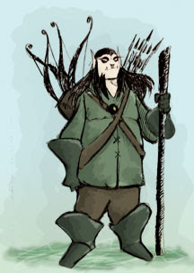
The last thing to do is to neaten the black lines up a little bit.

I have neatened up the lines and finished the tutorial but I think I did prefer how it looked before I neatened it.

Cloud Brush Tutorial

One of the smaller tasks we were given is to complete a tutorial teaching us about custom brushes. In this we have to create a cloud brush so we can later use it to create a cloud scene.

I followed the tutorial given and this is the cloud brush I have created:

After changing some of the brush presets to get a more random brush stroke this is what I got from a single brush stroke:
Next is to start the actual cloud image.

I added a gradient of a pale and darker blue for the background and used the cloud brush I just created to make the darker layer of the clouds.


I created a third layer for the light layer of clouds:

I want them to look like they belong together a little more so maybe I'll try and play around with a few brushes to get it looking the way I want, my cloud brush on its own doesn't seem to be doing it properly.


The white cloud is a little to white so I'm gonna play around with the opacity and some of the layer effects to see what makes it look good.

I used the overlay layer effect and set the opacity to 80% to get looking like this and I am reasonably happy it.


Wednesday, 21 March 2012

Organic and Machine 2

I decided not to go with the big watch head because it didn't look right for a mechanic/organic fusion.

Before I start experimenting with mechanical parts again I wanted correct the original drawing. Whilst speaking with the tutor during the last class it was pointed out that the foreshortening in the leg was wrong and he might look a little more human with a face.

I sorted out the leg on paper because I thought it would be easier than doing it in Photoshop.
I wanted to do the face in Photoshop because I'm not very good at drawing them and I didn't want to ruin the paper by rubbing it out to much. I also tried to sort out the foot because it looks like its at an odd angle.
The foot still looks a little odd but that was the best I could get and it's the same with his face. It might look a little better if I add some shading.
I neatened up the outlines as well and I think I was right about the face looking a little better with some shading on it. I haven't shaded the cloth yet but I will do that after I have decided how I have turned part machine. I still like the pipes at the neck so I think the next step is to put them back on him.
I have made the pipes a little bigger like I said I would in a previous post and I think they look a little better. I'm not sure what to do next so I'm leaving it for today and I'm going to do some artist research tomorrow to see what other people have done with this kind of thing.